Help Center Design: What the Best Support Sites Get Right
Break down the 5 design patterns top help centers like Stripe, Notion, and Linear use to reduce support tickets by up to 40% — and how to apply them yourself.

Stripe’s help center resolves 85% of queries without a single support ticket. Linear’s docs have a near-zero bounce rate. Meanwhile, most help centers feel like digital filing cabinets — rows of links nobody clicks, a search bar that returns noise, and branding that screams “afterthought.”
The difference isn’t budget. It’s design decisions. Here are the patterns the best support sites share — and how to steal them.
1. Search That Actually Understands Intent
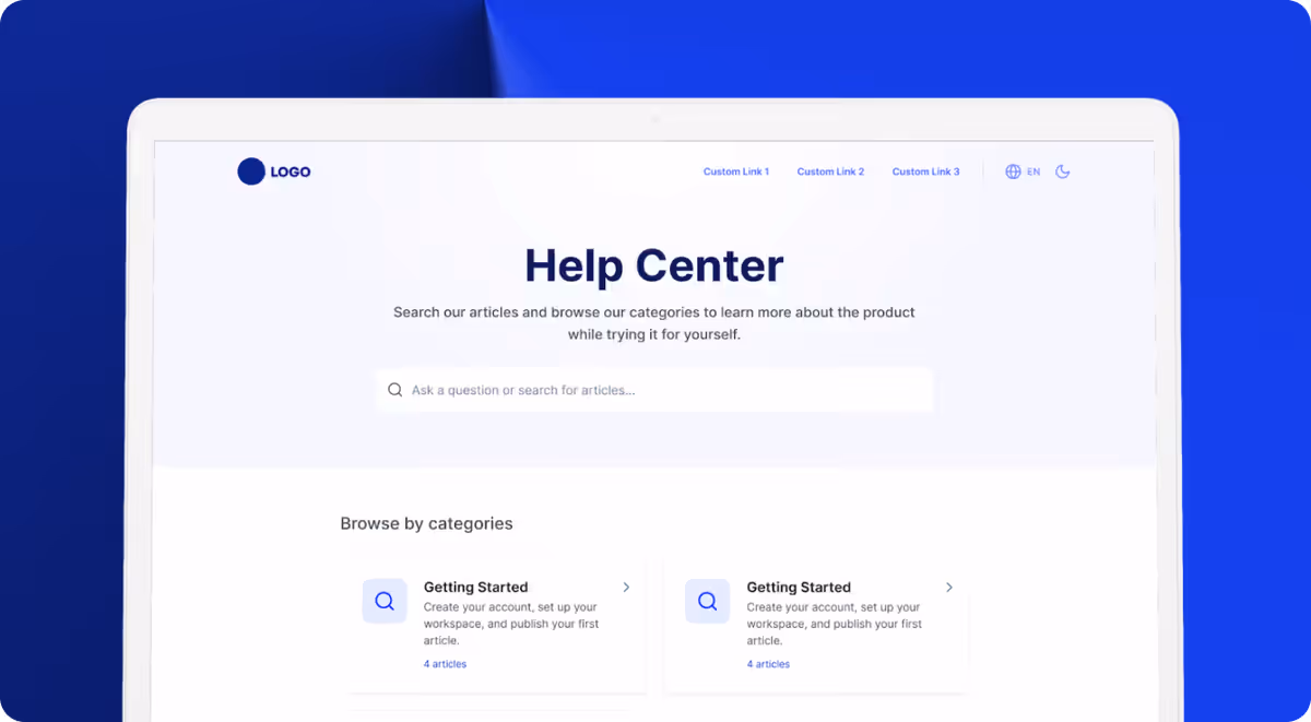
The single highest-impact element on any help center is search. Stripe, Notion, and Intercom all put a large, prominent search bar front and center — not tucked into a corner.
But placement is only half the story. Great help center search does three things:
- Handles synonyms and typos. A user searching “cancel subscription” should match an article titled “How to manage your billing plan.”
- Ranks by relevance, not recency. The most-viewed article on a topic should surface first, not the one published yesterday.
- Shows instant previews. Displaying a snippet of the answer in the dropdown saves users a click — and often resolves the question entirely.
According to Forrester, 53% of online customers will abandon a purchase if they can’t find a quick answer. A mediocre search bar is a revenue leak.
2. Flat, Scannable Navigation
The worst help centers bury content 3-4 levels deep. The best ones keep navigation flat: 5-8 top-level categories, each with a clear icon and a one-line description.
Look at Linear’s help center. Every category is visible on the homepage. No dropdowns, no mega-menus. Users see the full map of available help in under two seconds.
The rule: if a customer needs more than two clicks to reach any article, your information architecture needs work.
3. Consistent, On-Brand Visual Design
A help center that looks like a different product erodes trust. The best support sites match their main product’s typography, colors, and component style exactly.
This sounds obvious, but most teams get it wrong because their help center runs on a different platform with different templates. The result is a jarring visual disconnect — different fonts, off-brand colors, generic layouts.
Your help center is often the first place a frustrated user lands. If it looks polished and familiar, you’ve already reduced their anxiety before they read a single word.
4. Feedback Loops on Every Article
Stripe and Notion both include a simple “Was this helpful?” prompt at the bottom of every article. This tiny interaction generates enormous value:
- Articles with low helpfulness scores get flagged for rewriting.
- Search terms that lead to unhelpful articles reveal content gaps.
- Over time, your help center self-improves based on real user signals.
Without feedback, you’re publishing into a void. You have no idea which articles work and which ones waste everyone’s time.
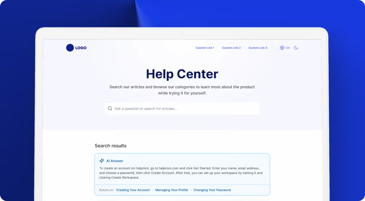
5. AI That Augments, Not Replaces
The latest generation of help centers uses AI to surface instant answers from existing articles — not to generate responses from thin air. This is a critical distinction. AI-generated answers without source articles hallucinate. AI that pulls from your verified content delivers accurate, trustworthy responses.
The best implementations show the AI answer alongside a link to the source article, so users can verify and go deeper if needed.
How Helprism Gets This Right
Helprism was built around these five patterns. Every workspace gets a branded, searchable help center with flat category navigation, AI-powered search, article feedback collection, and an AI answer bot that cites your actual articles.
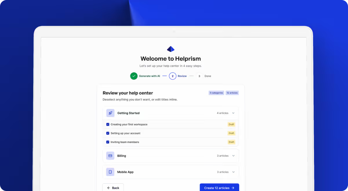
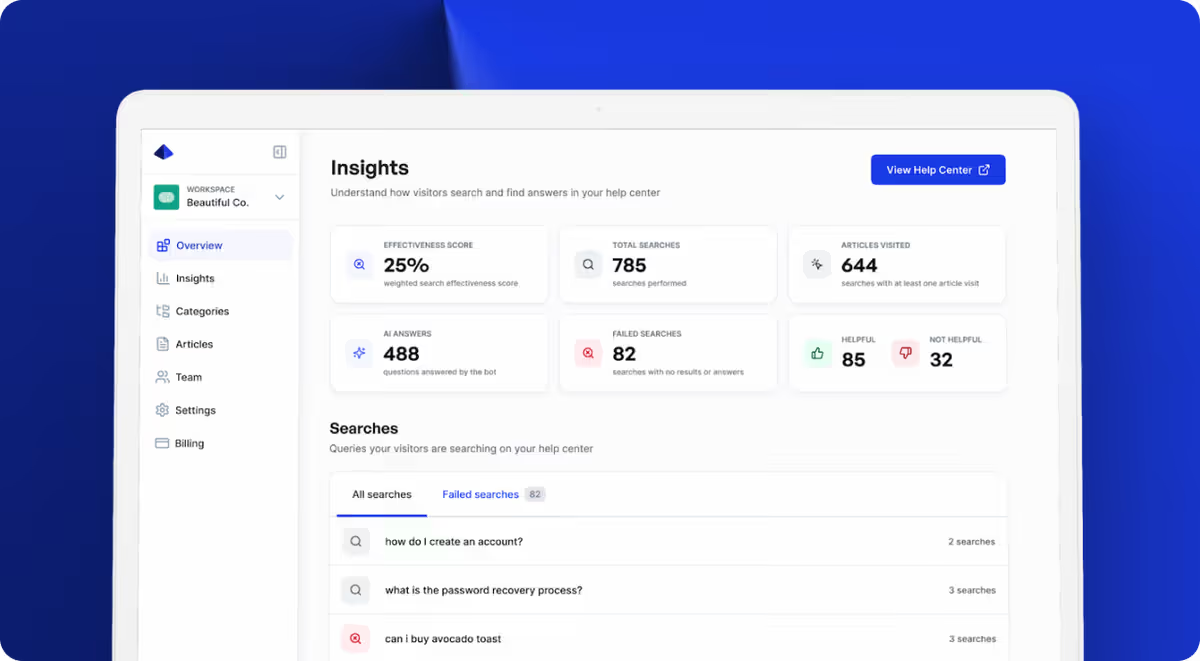
The setup takes minutes, not weeks. Paste your URL, and the AI onboarding wizard generates categories and articles from your existing site content. The analytics dashboard tracks search effectiveness, failed searches, and per-article feedback — so you know exactly what to improve.
The free plan includes 1 user and 10 articles at $0/month. When you’re ready to scale, Starter ($19/mo), Pro ($49/mo), and Business ($99/mo) plans unlock more users, articles, custom domains, and the AI answer bot.
The Bottom Line
Great help center design isn’t about aesthetics. It’s about reducing friction between a confused user and the answer they need. Nail search, keep navigation flat, stay on-brand, collect feedback, and use AI to surface answers faster. Do those five things and your help center becomes a support multiplier instead of a support afterthought.
Ready to get started?
Paste your URL. Review the draft. Publish. Your help center is live before your coffee gets cold.
Start Free →